Showing posts with label Letterpress. Show all posts

Friday, April 5, 2013

OTA Collateral Redux


I already gushed about my OTA experience so I'll try to contain myself a little in this post. I wanted to recap some of the other collateral Spark was asked to print and design for the OTA event. Using the new identity (designed by Funky Fresh) we created two of my favorite pieces ever – the OTA Manifesto and the Class of 2013 prints. Each attendee received a box of at the end of the sessions that included these two pieces as shown above.

The OTA Manifesto is a masterfully-written piece by OTA curator, Hugh Weber. Hugh and I met about the pieces we would be designing and his direction allowed me to leave the meeting knowing what I wanted to do for the look. As I always feel with every project I'm passionate about, I was nervous to send the first draft, but fortunately he and I were on the proverbial "same page" regardling the look. With only a few edits we got the file ready for press, and I couldn't be more pleased with the results. (Side note: My mom loved it so much that she said she wanted Hugh and I to collaborate on something similar for her funeral. I think that is a compliment to both of us, yet also disturbing. P.S. She is not near death as far as I can tell.)
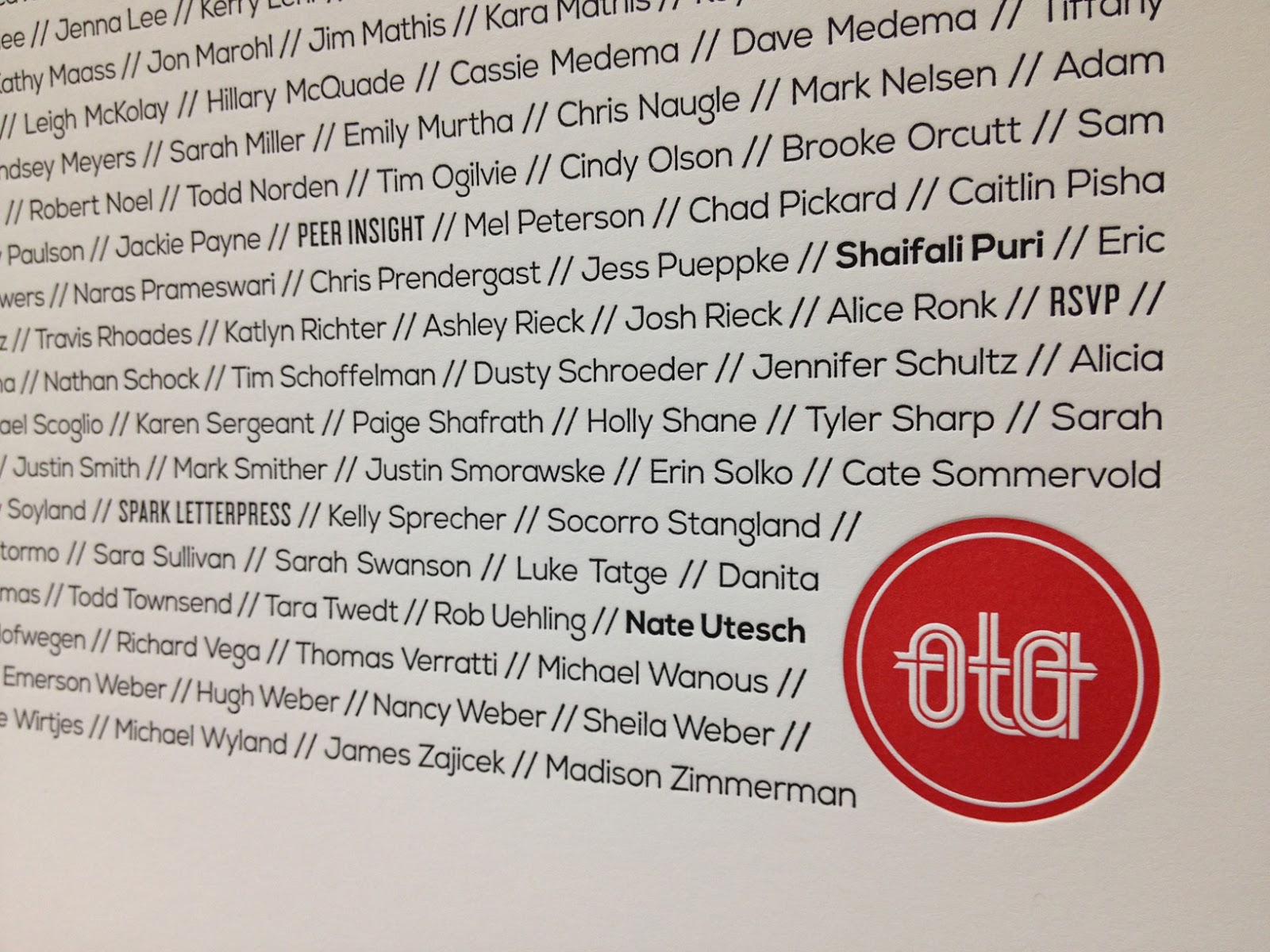

The Class of 2013 piece came about as a way to build off of the OTA community Hugh has worked tirelessly to develop. I believe very much in finding new ways to help people feel tied to one another as a way to enhance and further our community. As attendees we believed in ourselves enough to take the time to be educated, inspired and re-energized by the presenters. With more than 300 attendees that day, we all left with this piece as a memento of what we shared collectively.


As for the technical details of these pieces, they were both printed on our Heidelberg KS Cylinder press using Neenah Classic Crest 165# Cover in Solar White. We used a custom opaque red ink we created for specifically for OTA, along with black and transparent silver. The finishing touch was definitely the OTA red painted edges.

Along with these pieces, we printed some additional collateral designed by Funky Fresh including a sponsor card, box label, name tags and the OTA identity pieces. The name tags are based on a brochure design I had done seven years ago, a matchbook style piece set with eyelets. The name tags unfolded to reveal two interior pages with the day's schedule and a list of sponsors. The covers were color coded to differentiate the attendees, speakers and volunteers. I will say that my right hand was very sore by the time I set the 700th eyelet, but that's how we roll at Spark. You give us a project where the details make all the difference and we are all in!


Sunday, March 24, 2013

My OTA Experience


Have you ever been involved in something so amazing that it is hard to put your thoughts and feelings into words because you are worried that some small, but ridiculously important detail will be overlooked? That was OTA for me and Spark.

OTA is a collaborative of creative catalysts and community changemakers that connects the social and creative capital of South Dakota, North Dakota and Minnesota. You can learn more by visiting the OTA website. OTA founder and curator, Hugh Weber, was kind enough to bring Spark on board as a production partner for this year's event, which means we were able to be a part of the fun printed collateral created for the event.

On March 15 the people of OTA converged on the Augustana College campus to take in a killer line-up of speakers. I'm not sure if I should refer to this group of fantastic individuals as speakers because they really were something far more exceptional. They didn't come to rattle off a few statistics or blandly sell a product or idea. They came to engage, entertain and inspire, all the while exceeding our expectations. Throughout the course of the day I was taken to lands near and far, provoked to think about abstract ideas and concrete solutions, challenged to live my life with more everything-that-is-awesome and less of the ordinary and expected.

Some of my favorite quotes from the day:

"Exceptional people can tell you why they are." -riCardo crespo of 20th Century Fox
"Do good work for good people." -Aaron Draplin of Draplin Design Co.
"You can't A/B test your way to a vision." -Karina van Schaardenburg of Foursquare
And pretty much everything that was said by Dave Brown of Holiday Matinee and MKG

Be sure to check out:

Pencils of Promise: What Adam Braun has accomplished since 2008 will astound you. The world needs more people like him who are willing to do what it takes to make a difference in the lives of children around the world.

Ferocious Quarterly: How could I not love what Nate Utesch has done to beautifully capture the talents of current artists? The power of print is alive and well in this publication.

Pre-Session Mailing

The first pieces we designed and printed were for a pre-session mailing to the speakers that they received two weeks before the event. The two pieces were wrapped in kraft paper, and tied with baker's twine and a note welcoming them to the OTA family.


Inside we had a card that asked the speakers to tell OTAns what they had in store for them. The cards said "Hey OTAns, preapre to be ______________ on March 15, 2013." Here are some examples of what was received. Fun, right?


The other piece in the mailing was an art print we designed of the OTA region including a vintage map in tone-on-tone transparent white, custom opaque red and black inks. We outlined the states with the speakers' names and used the intersections language from the OTA manifesto to tie it all together. Both pieces were printed on 29 pt. chipboard on the same press sheet on our Heidelberg KS Cylinder. 


Stay tuned for my next post about the OTA manifesto and class of 2013 prints and the other pieces!

-Valerie


Thursday, December 6, 2012

Kate Holstein Calling Cards


Our recent printing of Kate Holstein Photographs calling cards were printed with our cool gray ink on our eco-friendly cotton 2-ply paper. The multi-talented Kate used watercolor to get the background gray effect. Logo design by Meagan Tidwell.

Thursday, October 11, 2012

Retailer Profile: Smudge Designs

The mother/daughter duo!

Smudge Designs
Julie Stern and Joanna Stern, Owners
132 Sheppard Avenue West, Suite 210
Toronto, Ontario M2N 1M5
Canada
Tel:  647 347 4343

How long have you been in business?
We have been in business now for 4 years! Whew. 


When did you realize that the stationery business was the right one for you?
My mom (Julie) and I were brainstorming invitation ideas for an anniversary party she was throwing. We were having so much fun together coming up with ideas and researching different printing methods that we never wanted it to end. We love that we can put our crazy ideas to good use.


What part of working with new brides is the most exciting?
I love when the bride receives the final product. Seeing their reaction, seeing how excited and happy they are is always a delight.


When people say, "well it's just paper…it's going to get thrown away anyway" what is your reaction?!
That’s always a tough thing to hear. But custom stationery isn’t for everyone. We just politely tell people that we are very passionate about invitations and the impact they can have on your event. We are true believers that it starts off the wedding, and can really get people excited about the events to follow.


What do you do with card and invites you receive from family and friends?
I love receiving invitations! I have saved every invitation I have received since my bar/bat mitzvah days. They stay on the fridge until the event then they are carefully placed into a memory box.


What tip can you give a bride about the invites she might order?
Make sure to be honest about your budget. I know it’s an icky topic, but it needs to be talked about. We want every client to be comfortable with the amount they are spending, and can work within a budget to create something beautiful. But you have to let us know what that budget is.
 

What is a color combo that you're in love with right now for invites this season?
Anything and everything GOLD! I am dying over gold foil with blush ink. I also like to keep warm in the colder months (Canada gets freezing!) so I find using softer grey’s and pewter tones instead of black help to give the invitation some much needed warmth.


Do you find Pinterest and Facebook helpful when relating with potential clients and how do you utilize social media?
Yes and no. It is always good to have visuals and inspiration to start off the invitation process. Having a client know exactly what they want is always helpful. However, pinterest and facebook can also provide too many options, and it sometimes may be overwhelming. We try and blog as often as we can...it’s a great place to show off recent jobs we have done and it gives a potential client a sense of our style and who we are.


Brides rarely have a clue what they want when they sit down for invites…how do you lead them in the right direction to find their dream invites?
It is perfectly okay not to know what you want! First and most importantly we want them to relax and enjoy the process. It shouldn’t be stressful it should be fun! We like to chat, joke and get to know each other first. We ask the simple questions, do you have wedding colors, is your event formal, are you more traditional or more modern, where is the event taking place. After we have a bit more of an understanding we begin to flip through books and invitations carefully selected by us that we think will fit your needs. We like to sticky note invitations of interest, and we will re-visit them later. Once the bride has selected a couple options, we look at her choices in more detail and begin to customize it more towards her needs.


What trend are you seeing this season for invites?
Foil has been a huge trend this season. It is a great way to jazz up an invitation, and create visual interest. Gold foil especially.


Best advice for bride or bride-to-be about finding the perfect invite suite?!
Forget about trends, forget about what other people are doing, forget about what other people are telling you to do. Focus on what you and your fiancé like and will be happy with.


The Spark sisters met Julie and Joanna at the National Stationery Show in May.  We are thrilled to have them selling our custom letterpress stationery!

Saturday, April 7, 2012

National Stationery Show here we come!


Well, the National Stationery Show is still weeks away, but amidst the craziness that is wedding season here at Spark, we are spending every spare millisecond preparing for the stationery industry's biggest show of the year! Whether it is putting the final touches on some of our notecard designs or press checking a freshly picked Pantone color, we are all about new product lines here at Spark in 2012.

Here is a brief summary of what we will be debuting at NSS:
  • Party Papers: A line of letterpress lovelies for the stylish soiree. We're giving all of you hosts and hostesses a running start on your next party with this new line or ready-made party stationery including invitations, thank yous, coasters, gift tags, place cards, decorative food picks and small signage. Choose from our lightly-themed designs and coordinating pieces to make your event shine when all of those little paper details are attended to perfectly!
  • Foil + Letterpress Cards: It was a thrilling moment when I hit the send button to get our copper engraving dies made for our new line of foil and letterpress blank cards. We have been doing foil on many other things here at Spark for years, so we figured it was about time to pair our two favorites together for a stunning suite of cards. Four patterns will be available and each will be done in two colorways.
  • Our Signature Collection: Like many of our esteemed colleagues in the world of paper, we have a few patterns and some stunning vintage maps as part of our collection. Tired of being relegated to the occasional envelope liner or only being printed in subdued tones, these cards take advantage of some of our favorite colors (think bright, fluorescent and metallic) and are ready to jump out of their adorable little boxes into the hands of retailers everywhere.
  • Impress: We launched this line at the beginning of 2012 to a small group of current Spark retailers and are ready to show off what this line is all about at NSS. We are only looking for a select few more retailers because this couture line is meant to be lovingly represented. If you are interested, please make it a point to see us early in your show plan so we can talk the talk!
  • Mitzvah: Many of you that we have talked to over the past few years are muttering to yourselves "it's about time!" and we couldn't agree more. We know we've promised to get this line out for a while now, but we promise that good things come to those who wait! You can check out some of our more fun non-traditional designs as well as those with a more classic feel. Either way, everything we offer for this line is fully customizable.
  • The Pressroom: In 2011 Spark undertook a major endeavor of launching an online-only company to carry designs of some of our favorite stationery designers (who also happen to be some of the most talented out there)! The Pressroom has met great success and we are excited to share these amazing designs with our retailers. You can expand your collection of event stationery designs by more than 80 when you purchase the rights to represent The Pressroom.
NSS Buyers, visit us in Booth 2174/2175!

Thursday, December 29, 2011

Introducing Spark Impress - New for 2012!


Spark Impress is more than our newest collection, it is the blueprint of what's next for the design studio at Spark. Whether you need custom stationery for a wedding or Mitzvah or simply want to write some beautiful notes to a friend; we will work with you to create stunning paper goods that fit your personal style. In addition to our design services, we handle letterpress printing, foil stamping, die cutting and intricate finishing methods in-house which means your order is lovingly cared for from start to finish. The 2012 Impress Collection Includes:

Gemma.
Dark purple matte and gold and gray metallic papers along with gold and purple inks create this stunning color palette. A new trifold design opens to reveal the invitation and a petite belly band holding additional cards.


Mia.
Cream cotton and Japanese cane papers paired with melon, sunshine and mocha inks. A die cut seashell tag and folded seashell weekend events card make this suite even more special.


Andrea. Navy and fuchsia are paired in matte and metallic papers for a vibrantly chic look. This suite features a laser cut belly band and weekend booklet cover. All pieces fit nicely into our new luxury mailer.


Carina. This simply designed suite has a timeless quality and can easily be modified. Midori ribbon, Arturo paper and our house cotton stock all come together beautifully in this new square mock trifold design housed in pointed flap inner and outer envelopes.


Chelsea. Museum board and pale peach metallic papers coordinate swimmingly with pearlized peach foil used throughout the suite for the magnolia art. Our new calligraphy font is paired with classically styled fonts for an understated yet charming look.


Daphne. Already a favorite of our staff, this cheerful collection tells the couple's story through the die cut initials and heart invite. A modern tin sealed with a mailing label holds the various pieces including a reply postcard and detailed map.


Hilary. This oversized invite panel pairs cooper foil with steel ink and thick Arturo paper in soft white. The copper foil on the invite and reception card complement the copper metallic paper. A square crystal adorns the invite, menu and accessory sleeve.


Alyssa.
This suite has it all - a pale amethyst crystal adorning the invitation, lilac color edging, our new calligraphy font and a laser cut wrap like no other. Arturo papers and envelopes only enhance the gorgeous details of this suite, especially the tone-on-tone letterpress printing.


Whitney.
The photos do not do this suite justice - what can be pared down to a lovely black and white suite, has been all dressed up with its details. Two new items for Spark include a luxury mailer with a curved flap and a coordinating accessory sleeve to hold additional cards.


Zoe. White foil and clear varnish letterpress create a tone-on-tone look to keep everything understated. Bright purple accents in the color edging, liners and backers that pop of color. This modern suite is perfect for the minimalist and type-loving couple.


Katherine. Based on one of our most popular custom designs, this design shows transparent gold and gold inks - one of our most popular pairings. The main panel uses our thickest paper, 4-ply museum board which pairs nicely with our soft white papers.


Tessa. Our increasingly requested airline ticket invitation design can be customized with almost any of our maps and your client's destination. Luggage tag die cuts complete this suite for a save the date or welcome basket, and can be finished with an eyelet, ribbon or string.


Visit an Impress Dealer to get started.
Spark has enlisted an intimate group of our best dealers nationwide who can help you create the stationery of your dreams. Our Impress dealers are just receiving the designs above in the stunning box pictured below, so CONTACT US to find a dealer near you. If you do not have an Impress dealer in your area, we are able to work with you directly.