


I already gushed about my OTA experience so I'll try to contain myself a little in this post. I wanted to recap some of the other collateral Spark was asked to print and design for the OTA event. Using the new identity (designed by Funky Fresh) we created two of my favorite pieces ever – the OTA Manifesto and the Class of 2013 prints. Each attendee received a box of at the end of the sessions that included these two pieces as shown above.
The OTA Manifesto is a masterfully-written piece by OTA curator, Hugh Weber. Hugh and I met about the pieces we would be designing and his direction allowed me to leave the meeting knowing what I wanted to do for the look. As I always feel with every project I'm passionate about, I was nervous to send the first draft, but fortunately he and I were on the proverbial "same page" regardling the look. With only a few edits we got the file ready for press, and I couldn't be more pleased with the results. (Side note: My mom loved it so much that she said she wanted Hugh and I to collaborate on something similar for her funeral. I think that is a compliment to both of us, yet also disturbing. P.S. She is not near death as far as I can tell.)
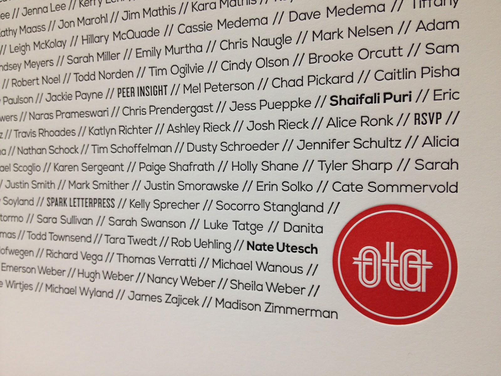
The Class of 2013 piece came about as a way to build off of the OTA community Hugh has worked tirelessly to develop. I believe very much in finding new ways to help people feel tied to one another as a way to enhance and further our community. As attendees we believed in ourselves enough to take the time to be educated, inspired and re-energized by the presenters. With more than 300 attendees that day, we all left with this piece as a memento of what we shared collectively.


As for the technical details of these pieces, they were both printed on our Heidelberg KS Cylinder press using Neenah Classic Crest 165# Cover in Solar White. We used a custom opaque red ink we created for specifically for OTA, along with black and transparent silver. The finishing touch was definitely the OTA red painted edges.
Along with these pieces, we printed some additional collateral designed by Funky Fresh including a sponsor card, box label, name tags and the OTA identity pieces. The name tags are based on a brochure design I had done seven years ago, a matchbook style piece set with eyelets. The name tags unfolded to reveal two interior pages with the day's schedule and a list of sponsors. The covers were color coded to differentiate the attendees, speakers and volunteers. I will say that my right hand was very sore by the time I set the 700th eyelet, but that's how we roll at Spark. You give us a project where the details make all the difference and we are all in!

No comments:
Post a Comment